

Welcome to Part #3 of The Start a Money-Making Blog Series! I’m super excited that you are ready to take it to the next level and create a color palette for your blog. Choosing the right colors will give your blog a professional look and feel while creating a cohesive story across your brand.
Before we jump in, here is a review of what we covered in Parts 1 & 2:
In Part 1, we covered:
- Getting into the success mindset
- Defining the goal of your blog and your value proposition
- Blogging as a business
In Part 2, we covered:
- Building your blog & choosing your web host
- Setting up WordPress
- Add Content and Key Pages to Your Site
Ready for Part 3?
Great, the good news is you don’t need to hire out someone for thousands of dollars to make your blog look professional!
For the purpose of this post, I am going to focus only on what you need to create a color palette for your blog to get you off the ground and running in the right direction.
Designing your site and brand is so much fun. This is one of my favorite steps when it comes to creating a new blog.
Let’s go!
Branding Your Blog
First of all, branding is an enormous topic, and we are only going to skim the surface here.
Your brand is waaaay bigger than the images, fonts, and colors that make up your site design, BUT the color and design are definitely critical.
After all, we are very visual beings. What we see affects our experience and impacts our first impression.
For example, two people walk into a meeting.
One person is perfectly put together, hair, nails, #feelingGoodasHell, and the other person runs in just in the nick of time, frazzled looking, post-its falling out of a notebook, #yikes.
Even if Ms.-Post-its-everywhere is usually on her game but is just having an epically bad day, you immediately create an opinion based on what you see visually.
Now, let’s consider another example, shall we?
Take a peek at this stellar image I found in a branding article on Medium.com (article linked here).

You have two cups of coffee, potentially the exact same coffee, and yet you would, without thinking, pay more for one of them.
It’s mind-blowing, right?! A picture on an otherwise standard to-go coffee cup makes all the difference!
Now, we know that the Starbuck’s logo signifies more than just a green coffee-mermaid. It’s the expectation of a good cup of coffee no matter where in the world you buy it from.
Also, holding a Starbuck’s cup feels good. It feels better than holding a basic cup.
Why Should You Brand Your Blog?
When it comes to branding, I like the definition from Seth Godin’s blog:
A brand is the set of expectations, memories, stories and relationships that, taken together, account for a consumer’s decision to choose one product or service over another.
– Seth Godin
Your brand will take time to develop, (I’m still working on mine every day), but taking the time to hone and evolve your brand will make a huge difference.
You may be thinking, “But Olivia, this. is. just. a. blog.”
To which I will reply:
This is your brand new money-making blog. Even though your blog posts are 100% free to read, you are still selling your blog.
You want your blog to look professional and give people a taste of your brand right when they arrive at your site.
You want people to be emotionally enticed to scroll and click around, right?
Right!
Anyway, as I mentioned, we are not diving deep into your brand strategy. BUT we are going to take your new blog to the next level with a brand color palette.
Colors are both fun and important for your new money-making blog. By simply defining brand colors, you can put together a cohesive story across your site.
You should also use your color palette when you design social media posts and emails. It helps them become instantly recognizable to your audience because they are “on-brand.”
Ok, let’s have some fun and create a color palette for your blog.
What Does Your Brand Convey
If you go back to Post 1 of the Start a Money-Making blog series you remember we defined “Who you serve,” which is key.
The better you know who you are targeting, the easier it is to pick colors that will speak to them.
Now grab a pen and paper, and write down what comes to your mind when answering this question:
When you think of your blog’s brand, what are some words that you hope your brand conveys to your ideal audience?
Don’t edit yourself!
Here are some ideas to get you started:
- Cozy
- Wealthy
- Modern
- Colorful
- Optimistic
- Empowering
- Beautiful
- Genuine
- Bold
- Healthy
- Rugged
- Luxurious
- Fresh
- Feminine
- Boss
- Happy
- Pink
Write down at least 3-5 words and keep these words handy for later.
Let’s Talk Color Psychology
You probably don’t usually think about the colors you see every day that fill your life. However, the colors on logos, ads, social media posts, and so on, play a large role in how attractive something is to you and your interest in learning more about it.
In fact, there is a lot of information readily available online about color psychology and how consumers make buying decisions based on color.
Different colors evoke different kinds of emotions and associations for us.
How often do you walk into a spa and see a bold red or bright orange accent wall? It’s more likely that you would see soothing greens or purples.
However, if you were going into a high-intensity gym, you may see an energetic color like orange.
Below are some examples of colors and what association those colors tend to have when it comes to emotions.
If any of them align with some of the words you came up with in the last activity, and you like them, that’s great!
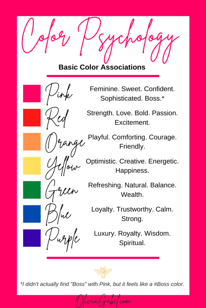
You don’t have to know what colors you will use to create a color palette for your blog yet, but it’s good to have some insight into color psychology so you can be mindful of colors you are picking for your ideal audience.
Create an Inspiration Board
You know I love scrolling images, especially on Pinterest and Instagram, and lucky for me, we are going to leverage Pinterest for this next activity.
Head on over to Pinterest (if you don’t have an account, you can create one for free), and create a new board called “My Brand Inspiration Board.”
We are going to be pinning inspirational images that align with what you want your brand to be to it!
Start searching for pictures with colors that you think look like your brand and save them (aka Pin them) to your board by pressing “Save” on the image.
You can search for images using the words you came up with earlier by typing things like:
- “Colorful branding ideas”
- “Modern”
- “Food blog color palette”
- “Wealth”
- “Wealth color palette”
- “Luxury
- “Cozy”
- “Blue color palette”
- “Calming color palette”
Whenever you see an image that you love and speaks to your brand, pin it to your board!
Once you start to find images that you like, Pinterest will suggest additional pins that are similar. You can even scroll down on a pin you like to see additional similar ideas.
Do this for as long as you want. You need at least 10-20 pins on your board.
Organize Your Inspiration Board
After you have enough pinned images, open your Inspiration board, and organize it by dragging the pins to the top that you like best.
Hopefully you can see a pattern in the types of colors you are leaning towards!
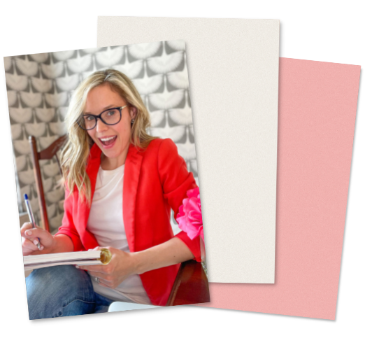
Here is a screenshot of a brand inspiration board I created, aren’t the colors fun?!

Now that your board is organized take a screenshot of it. (For additional information on taking a screenshot, check here.)
Ready for Some Color Magic?
Head on over to https://coolors.co and click “Start the generator.”
You will automatically see five randomly generated colors with hex codes (a universal number for a color in web design).
Time to upload your Inspiration board screenshot and allow coolors.co to generate a brand color palette for you based on what you alreadyfoundon Pinterest.
How to Upload Your Screenshot
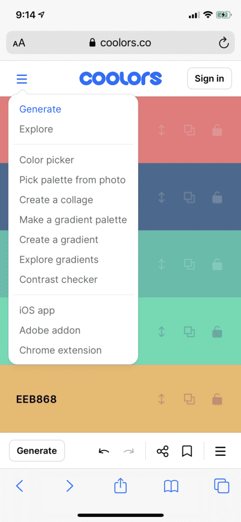
If you are on your phone, go to the upper left-hand side of the screen and click the three lines to expand the menu. Then click “Pick palette from photo.”
On a laptop, click the camera on the menu bar in the middle of the page, and you can upload your screenshot.
Boom! Colors!
You can generate new colors from the image over and over until you LOVE the colors.
Take screenshots of options you like while you are clicking through different options to review later.
How cool is coolors.co?!
I love how it can generate color palettes with colors and complementary colors from the image you uploaded.
*Hot tip! As you are clicking through color palette options, you may find a color or two that you like and want coolors.co to generate some complementary colors to those. You can use the lock icon on the colors you like, and those won’t change when you generate new colors.
Video Tutorial of coolors.co
If you remember from Part 2 of this series, I love a good YouTube tutorial. How lovely is it that someone has already posted a tutorial on how to uses coolors.co?
It’s only two and a half minutes, and while she does move kind of quick, it’s an easy tool, so I think it’s ok – Watch here.
Create a Color Palette that Works
Create a color palette for your blog with:
- A Primary color (the color you will use most)
- A Secondary color
- An accent color
- Black (or a shade of black, like dark gray)
- White
OR
Create a color palette for your blog with:
- A light color
- A dark color
- An accent color
- Black (or a shade of black, like dark gray)
- White
Remember, the above is just guidance. It’s YOUR brand. Choose colors that feel right to you and your audience. BUT I do suggest having Black and White in your palette.
- White is #FFFFFF
- Black is #000000
Sleep On It
This is a great activity to “sleep on” because it removes the burden of making a decision after you just spent a lot of energy reviewing tons of options.
How to Sleep On It:
- Take a screenshot of two or three color palette options you love
- Save them somewhere you can find them later
- Close them, and stop looking at them.
- Then sleep on it (or move on with your day if it’s the morning)
- Come back tomorrow or the next day and review your options
By taking the day or two away, you will get a fresh perspective so you can easily create a color palette for your blog. You may even have an immediate reaction to one, and either love it or hate it.
But don’t forget to make a choice. You can change it later, so pick a color palette and go for it!
You Created a Color Palette for Your Blog!
Look at you!!
You created a color palette and now your blog is on the way to looking truly professional.
On your blog, start using your brand colors for:
- Background color elements
- Borders
- Buttons
- Titles and Headers
- Coordinating images
Decision fatigue is a real thing, and having a color palette will make your life so much easier when designing your site, choosing images, and creating social posts.
Take it a step further and decide on the fonts you will use for your brand. Choosing one or two is one less decision to make later.
Can you Believe You Started a Money-Making Blog?!
You’ve just completed Part #1, Part #2, and Part #3 of the Start a Money-making Blog series, which means you started a blog!!
Cheers to YOU! That is truly incredible. You are on your way to building something you love.
While blogging isn’t for everyone, I know you’ve got what it takes.
The most important part of a blog is to deliver high-quality, valuable content consistently, and of course, tell everyone about it so they can read your brilliant posts.
I hope this series gave you the tools you needed to feel empowered to start your blogging journey.
If you have any questions, I’m just an email away!
Be the first to know about the best tips and tools to build your digital business by subscribing to my email list!

2 thoughts on “Part III – create a color palette for your blog”
You made some first rate factors there.
Thanks so much!
Comments are closed.